
![]()
Getting Rid of that Ugly Cyan Cast
![]()
This Tutorial shows what you can do to get rid of a heavy cyan cast in photos of sharks, manta rays, and other things shot in the blue.
As with many photos there is no defined workflow or sure way to achieve a pleasing result, it all comes down to playing around and see what works best. I'll try to introduce several techniques here including plate blending (channel mixing), levels adjustment, selective color correction, layer masks and blending modes. The picture you want to save might not need all those steps but when you are through with this tutorial you should have an idea of your options.
I won't explain how to handle the Photoshop tools in detail (i don't want to write a book ;) but will show my settings including some of the try and error ones.
This tutorial was written using Photoshop 7. It works exactly the same way with Photoshop CS. Some of the tools i used, like Selective Color are not present in Photoshop Elements.
There are several other ways to get rid of the cyan cast Photoshop and many other image processing tools offer similar functionality to improve your photos.
My source of information for the plate blending technique is a very interesting and well written wetpixel tutorial named Getting Rid of Underwater Blues written by Robert Delfs.
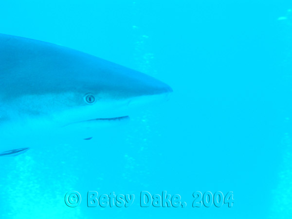
The photo i'm trying to save here is a shark portrait that was sent to me by Betsy aka RIdiver from the DD-Forum. It required a lot of work, i.e. this is a very long tutorial, but IMO was worth the effort.
I never managed to get such a close shot of a shark myself, i.e. most of the time you need a magnifying glass to be able to find the sharks on my pics :-)
My Photoshop is in German, but i have added the English names of commands, tabs, menus, ... in blue color on the screenshots. Settings and hints are black or red.
I have also added links to downloadable PSD files including all the layers and settings required for the different manipulation tasks. They all have a top level layer with Betsy's copyright, please respect that, because it is Betsy's photo. I used a font named "Hobo" for Betsy's copyright note. If this font isn't installed on your computer, Photoshop will display a warning when you open the PSD file. No need to worry, simply ignore it.
Have fun - Sabine
| Before | After | |||||
 |
 | |||||
| Missing reds are a common problem with many pictures of creatures in the blue, especially when shooting without strobe or when the animal is too far away for the strobe.
Let's have a look at the Red, Green and Blue channels of this picture. You need to be in RGB mode to do this, if not choose Image::Mode::RGB. To view the channels simply click on the Channels Tab right next to the Layers tab in your Layers palette. As you can see here the Red channel is almost completely black, indicating that there is no or very few red information. The Green channel is good, the Blue channel has too much contrast but is usable. Might be a job for the Channel Mixer |
 |
Problem #2:
The White Parts of the Shark Are Hard to Distinguish from the Water
| This is going to be a real problem, because getting the colors right on the shark will also alter the water.
We'll probably have to use 2 layers and a mask here to be able to manipulate the shark in one way and the water in another. |
 |
Problem #3:
Lots of Bubbles in the Background
| The more bubbles there are, the more we have to fix. Getting the color of the bubbles right (they should be white) will also alter the color of the water, resulting in a lot of extra work.
Fortunately there is a lot of water around the shark, giving us a chance to crop the photo to get rid of some of those bubbles and put more emphasis on the shark. Remember that the amount of cropping depends on the resolution of the original image. If we crop too much, the image gets too small to be printed or published. |
 |
![]()
B) Crop the Photo to Get Rid of Some Bubbles
It's better to crop the photo before you start correcting it.
When using the crop-tool, you can decide to crop to a predefined size or use the delete button of the crop-tool to delete all predefined settings and crop to your like.
(Use something like 2400x1800 (4:3) or 1500x1000 (3:2) to keep the aspect ratio but don't crop to values larger than the original resolution)
In any case make sure that the value for the dpi setting is empty, because you don't want to change that now.
The original size of Betsy's photo was only 600x450, i decided to keep the aspect ratio and crop to 400x300.
I also moved and changed the size of my area to crop several times until the shark was in a nice position. To move the area to crop simply drag it while keeping the left mouse key pressed or use the arrow keys (up, down, left, right) on your keyboard. To change the size drag one of the handles.
Crop-Tool Options and Settings used

Cropping ...

Here is the image after i cropped it.

Download the cropped PSD file (587 KB, right click and Save target as ...) to work with it from here on
![]()
C) Try a Quick Fix First
I usually play around with Photoshop's Auto-Adjustment Tools first. This will help me to get an idea of what to do and what to avoid.
I simply use Undo or go back 1 step in History if i don't like the result. You could also create a copy of the background layer (see Chapter D, Step 1 on how to do this) and simply delete that copy if you don't like it.
Here are the results (left half is adjusted, right half is original)
| Auto-Color | Auto-Contrast | Auto-Levels | ||||
 |
 |
 | ||||
| No visible change | Not much better | Way too much and still cyan | ||||
Select the Background Copy and create an adjustment layer for the channel mixer with: Layers::New Adjustment Layer::Channel Mixer. This opens the channel mixer dialog. Simply click OK to create the adjustment layer. The new adjustment layer should be placed on top of the Background Copy layer. If it is not, drag it there. Your layers palette should have 3 layers now, mine looks like this: |
 |
Step 3: Use the Channel Mixer
| To reopen the Channel Mixer Dialog simply double click on the Channel Mixer Symbol in it's adjustment layer.
The dialog should open with the section to manipulate the Red channel (i.e. Target Channel: Red) by default. If not, select Red as Target Channel now. Also make sure that the Preview option is selected, otherwise you don't see the impact. Now we need to increase the amounts of Green and Blue (both currently set to 0) to be added to the Red channel. You should play around here a little bit until you end up with an image where the neutrals (i.e. Black, White and Gray) are OK. The color of the water will probably look wrong now but we will fix that later. I ended up with Green +50% and Blue +25%. |
 |
When you click OK, the red channel is created from a mix of 75% of the Green channel and 25% of the Blue channel.
Now we have to find a good blending mode for the adjustment layer. We could leave it at "Normal" but i like "Lighten" even better.
Here is the layers palette with the blending mode, the altered image and the new red channel (see problem #1 on how to find it)
| Blending Mode "Lighten" | Image after Channel Mixer | New Red Channel | ||||
 |
 |
 | ||||
| Select the layer with the Channel Mixer and create another adjustment layer for the levels tool on top of it with:
Layers::New Adjustment Layer::Levels. This opens the Levels dialog. Simply click OK to create the adjustment layer. The new adjustment layer should be placed on top of the Channel Mixer. If it is not, drag it there. Select the Levels Adjustment layer and change the Blending Mode to "Luminance". Your layers palette should have 4 layers now, mine looks like this: |
 |
Step 2: Adjust Levels for Red, Green and Blue and RGB
The Levels Tool allows you to adjust the combined RGB values as well as the values for the Red, Green and Blue channels.
Whatever you do, try to be careful and not to drag the arrows into areas where there is color, it's better to stay within the safe areas.
Start adjusting Red,
As you can see, thanks to the channel mixer we now have some red to adjust.
Simply play with the Input Levels Shadow and Highlight values but keep within the safe areas, otherwise you will loose color information in the shadows and/or highlights.
My setting here is 75 for Shadows and 215 for highlights.
Here are the settings and the result:

Next adjust Green,
remember to stay within the safe areas although the image doesn't seem to change very much.
My only change here is 75 for Input Shadows.
Here are the settings and the result:

Now adjust Blue,
again try to stay within the safe areas, this leaves us some options for the combined RGB values.
I only changed the Input Shadow value to 145.
Here are the settings and the result:

Finally adjust RGB,
although there seems to be a safe area in the shadows, cutting it results in creating visible noise on the shark.
We only want to increase contrast in the midtones and highlights, this is done by reducing the Input Levels Midtone value.
I changed the Input Midtone value from 1 to 0,55.
Here are the settings and the result:

What is the Difference Between "Normal" and "Luminance" Blending
Still wondering why i asked you to set the Blending Mode of the Levels Adjustment Layer to "Luminance" ?
The reason is that i wanted the Levels Adjustment to increase contrast and not to alter the color of the image, because the shark is already close to neutral, i.e. it has lost the cyan cast.
Here you can compare the results of 3 other blending modes to luminance (right half)
| Normal (Magenta nosed shark) | Color Burn (Electric Blue shark) | Soft Light (Very Pale shark) | ||||
 |
 |
 | ||||
| Original: | Color Cyan: Cyan -100% | Color Blue: Black +100% | Color Gray Yellow +50% | |||
 |
 |
 |
 | |||
| Select the layer with the Levels Tool and create another adjustment layer for Selective Color on top of it with:
Layers::New Adjustment Layer::Selective Color. This opens the Selective Colors dialog. Simply click OK to create the adjustment layer. The new adjustment layer should be placed on top of the Levels Tool. If it is not, drag it there. There is no need to change the blending mode, "Normal" is OK here. Your layers palette should have 5 layers now, mine looks like this: |
 |
Step 2: Adjust Cyan, Blue, Gray and Black Selectively
The Selective Color Tool allows you to adjust specific colors in the image.
I will use it to change our "Lavender shark" into a more natural looking one (keeping in mind that i need to blend it with the background later on).
My guess is that i'll need to adjust Cyans (lighter), Blues (darker) and Grays (more yellow and lighter) here. I'll also enhance the Blacks, this will add sharpness to the eye.
Reopen the Selective Color Tool
| To reopen the dialog, simply double click on the Selective Color icon in the Selective Color adjustment layer.
By default the tool opens up with the settings for Reds, as shown here. The sample dialog should explain how to change the settings. To change another color, select it in the Colors options. To change the value for Cyan, Magenta, Red and Black move the slider ore enter the new value directly (use -50 to decrease 50%). Select a method, we'll use Absolute here. Don't forget to check Preview or you won't see your changes in the image. |
 |
Adjusting Cyans
This is actually the easiest way to get rid of a Cyan cast without altering other colors.
Decreasing Cyan in Cyan by 100% kind of removes it or makes it very light and grayish, but you will loose contrast also.
Decreasing Black in Cyans by 100% will make your cyans very light, almost white.
Increasing Black in Cyan by 100% will make your cyans very dark, almost black.
We'll try to make the cyans as light as possible to reduce them and get rid of noise in the lighter areas of the shark, i.e.
Choose Cyans as the Color to change and enter -100 as new value for Black or move the slider for Black completely to the left.

Adjusting Blues
In order to balance the contrast and also to get rid of the bluish cast left, we will now darken the blues.
Increasing Black in Blue by 100% will make our blues very dark, almost black.
Choose Blues as the Color to change and enter +100 as new value for Black or move the slider for Black completely to the right.

Adjusting Blacks
Making Blacks a little bit blacker is my way of adding extra contrast to dark areas, almost like using the unsharp mask on Black but without creating artifacts.
You can also use it to darken already dark areas in the background of an image.
I wanted to add contrast to the eye of our shark and added +10% black to Blacks. I haven't prepared an extra screenshot of the settings, because i assumed that you should know how to do it by now.

Download the PSD file including Selective Colors (918 KB, right click and Save target as ...) to work with it from here on
![]()
G) Add a Layer Mask to Separate the Shark from the Water
Now it is time to get rid of the ugly gray water. We'll simply create a layer mask on our Background Copy layer to hide it, which is NOT possible with Photoshop Elements !
We could have created the layer mask right after cropping the picture but i wanted you to be able to view the effects of our changes to the water also.
Before we start to paint the layer mask, we should reduce our number of layers, otherwise we'll muddle them up sooner or later.
Step 1: Merging Layers.
Photoshop has several options to merge or reduce layers.
I prefer to use Merge Down unless i have more than 10 layers to merge.
Here we need to merge the 3 adjustment layers and the Background Copy layer. You can either make sure that these 4 are the only visible layers (check the eye symbols) and use Shift+Ctrl+E,
or you can merge them one after the other by selecting the Channel Mixer Layer and merge with Ctrl+E (no Shift), next select the Levels layer and merge with Ctrl+E and finally select the Selective Color Layer and merge again with Ctrl+E (or Layers::Merge Down).
| It's a bit difficult to show the merge process in a screenshot, but when you are ready your layers palette should look like mine here and your image should be unaltered.
I have only 2 layers left now, my original Background and my adjusted Background Copy. |
 |
Step 2: Create a Layer Mask for the Background Copy Layer.
There are 2 ways to create the layer mask, we can either create a filled mask with Layers::Add Layer Masks::New (option: filled),
or we can select as much water as we can in our image and create the layer mask from that selection with Layers::Add Layer Masks::New Layer mask (option: mask selected).
I decided to roughly select the shark and create the mask from that selection. You can use the lasso or the healing patch as selection tools. I prefer to use the healing tool, it seems to allow more accurate selections.
The next step is to select the layer where you want to add the mask, in our case that's the Background Copy layer and simply click on the Layer mask Symbol at the bottom of your layers palette.
This creates a layer mask from our selection (as shown below).
Tool tip: Photoshop doesn't allow you to create a layer mask for the background or bottom layer, because there is nothing left to show below it.
| My selection | Create the Mask | |||
 |
 | |||
| Layer with Mask | Resulting Image | |||
 |
 | |||
| Visible Mask Channel | Invisible Mask Channel | |||
 |
 | |||
| Mask with Selection after Contract | Inverted Selection filled with Black | |||
 |
 | |||
Check the masked image to make sure that we didn't mask too much of the shark. If necessary, correct the mask by painting white close to the edge of the mask. You can also switch the mask off to see how the unmasked picture looks like (not shown here). Here is what my masked image now looks like. The areas where the edge of the shark is masked are clearly visible. I still need to correct the mask on the upper edge of the shark. |
 |
Applying a Gaussian Blur.
Make sure that the Mask Channel is still selected and choose Filters::Blur:Gaussian Blur. This opens the Gaussian Blur Dialog (not shown here).
Enter 1,5 (pixel) as radius to blur and click OK.
Apply the Gaussian Blur again, but this time with only 1 pixel as radius to blur.
Here is my mask and the resulting image
| Blurred Mask | Resulting Image | |||
 |
 | |||
| In the Layers Palette, select the Background layer.
Now click on the "New Layer Symbol" at the bottom of the palette. This adds a new layer named Layer 1 on top of the Background layer. If your new layer is not right above the Background layer, simply drag it there. Next select the new layer and change it's opacity to 20%. Your layers palette should now look like this: |
 |
Create a Layer mask for the new layer, protecting the shark.
Before we fill the layer, we'll better select the water only, we don't want to paint the gradient on the shark.
We can simply reuse the inverted version of our existing layer mask to select the water.
(#1) In the layers palette, select the new layer and add an empty layer mask (as described in the previous section, Step 2: Create a Layer Mask for the Background Copy Layer).
(#2) Now click on the Layer mask of the Background Copy Layer to activate it and copy the mask using these shortcuts: Ctrl+A (Select All), Ctrl+C (Copy) and Ctrl+D (Deselect).
(#3) Next click on the New Layer mask (for our new empty Layer 1) to activate this one.
(#4) Now Switch to Channels, select the channel with the new mask and paste the copy of the old mask with Ctrl+V
(#5) With channel still selected, finally invert the new Mask with Image::Apply::Invert (or use Ctrl+I)
| #1 Create New Layer Mask | #2 Activate + Copy Old mask | #3 Select New Layer Mask | ||
 |
 |
 | ||
| #4 New Mask after Paste | #5 Inverted New Mask | |||
 |
 | |||
| Select the Gradient Tool in the Tool Palette.
It maybe hidden under the Paint Bucket.  
Next set the foreground color to a very dark blue (000066) and the background color to white (FFFFFF). Now select the first Gradient Option from the choice. |
 |

To paint the gradient, make sure that the new Layer 1 is selected in the layers palette (click on the layer symbol, not on the mask).
With the Gradient Tool draw a straight line upward (i.e. from the Bottom to the Top). Its better to start painting a little bit below the bottom and end a bit above the top to make sure to fill the whole image.
With the Gradient painted you might increase the Layers Opacity, i changed it to 25%.
Note that the Gradient fill also helps to disguise noise in the background water.
Your image should now look like this:
| Selected Layer with Gradient | Resulting Image | |||
 |
 | |||
| Select the Background layer and create a new adjustment layer for Selective Color on top of it as described before.
Change the opacity of the new adjustment layer to 50%. 50% is good for a start, you might change it later to get a better result. Normal works well as a blending mode, but you might also try Luminance, Darken or Multiply. Your layers palette should now look like this: |
 |
Adjust Colors Until Satisfied
What we are doing now is very much a question of personal taste. I think that the water is still too cyan and that it could be even darker. I also want to get rid of the cyan in the remaining bubbles.
I'll explain what i think i have to adjust here and give you an overview of the settings i ended up with after that.
My guess is that i should start adjusting the Cyans.
Increasing 10-20% Black should make them darker, decreasing Yellow should make them bluer and decreasing Cyan should make them more neutral. This will correct the water and the bubbles.
I'll continue with the Blues now.
The water is not dark enough for me, but increasing ~ 50% of Black will do the trick. I'll also play around with Yellow and Magenta to see if i can achieve an even better result.
Next color to play with is Whites
The bubbles are still too dark and too cyan and i'll try to make them a bit lighter by decreasing Cyan and Black as much as possible (i.e. - 100%).
Grays are the last color to change here.
Adjusting Grays has the most impact on all colors in the image that are not pure. Therefore we have to be really careful here. Download the jpg image from above and try it for yourself.
For my taste, the water is not dark enough yet and still too cyan. Increasing Black in Gray will make the water even darker and decreasing Cyan will make it more neutral.
Here is an overview of my Selective Color Settings, all using Absolute as Method:
| Cyans: | Blues: | |||
 |
 | |||
Whites: | Grays: | |||
 |
 | |||
| Flying Shark | Rainbow Shark | Space Shark | ||
 |
 |
 | ||
| Select the original Background layer and drag it on the "New Layer" symbol at the bottom of the layers palette (or right click on the background layer and choose duplicate layer from the popup menu, see Chapter D, Step 1 for details).
Make sure that the new layer (Background Copy 2) is placed above the original Background layer and below the adjustment layer for Selective Color. If not, simply drag it there. Your layers palette should now look like this: |
 |
Step 2: Merge Background Layers
| Now you need to merge the new copy of the background layer with the Color Correction layer and the Gradient layer (Layer 1).
Don't touch or merge the original Background Layer, we need it later on. If you accidentally merge it, use Undo or go back in History. The technique to merge layers is explained in Chapter C, Step 1. I suggest that you simply select the Selective Color Layer and merge down with Ctrl+E. Next select the Gradient Layer (Layer 1) and merge down again using Ctrl+E. Your layers palette should now look like this: |
 |
Step 3: Rename Remaining Layers
| We'll start copying our layers now and don't want to get confused by all those copies of copies of copies.
It is time to rename our layers to make sure which is which. Tool tip: You cannot rename the background layer. To rename a layer, simply double click on it's name. Now you can now edit the name, i.e. enter another one. Cklick outside of the highlighted area to end renaming. Your layers palette should now look like this: |
 |
Step 4: Copy the Shark Layer and Change Layer Opacities
| Create a Copy of the Shark layer (as described in Step 1).
Change the opacity of the lower Shark layer to 75% and rename the layer to Shark 75. Change the opacity of the upper Shark layer (i.e. the copy) to 50% and rename it Shark 50. Your layers palette should now look like this: |
 |
You may have noticed that a bit of the background came through after reducing the opacity of the Shark 75 layer and that we reduced that effect with the Shark 50 layer, although it's opacity is only 50%.
The reason why we are doing this (and allowing the shark to get more cyan again) is that we need to blend the shark with the background to make the image look natural.
Step 5: Copy the Adjusted Background Layer and Create a Layer Mask
The next step might seem a bit complicated but you have done it before, i.e. there is nothing new.
We'll create a copy of the Adjusted Background Layer, place it on top of the shark 50 layer, by dragging it there and (see Chaper G, Steps 1-4) create a blurred layer mask for it, allowing some of the adjusted background to wash into the shark.
| Create a Copy of the Adjusted Background layer (as described in Step 1).
Now drag the new layer on top of the Shark 50 layer: Select the layer and with your left mouse key pressed drag it upwards. Don't worry about hiding our adjusted shark, the layer mask will fix that. Rename the new layer to Water or Transition to BG or whatever you like. Select the Layer and create a Layer Mask for it (see Chapter G, Step 2). Your layers palette should now look like this: |
 |
Step 6: Fill the Layer Mask
Chapter H, Step 1 describes in detail how to copy a Layer Mask, invert it's content and blur it.
We'll do exactly the same thing again now for the layer mask we just created, using the existing mask of the Shark 50 layer to copy from.
The only difference is that we'll use a Gaussian blur with a radius of 20 pixels now, to create a very smooth transition.
| Activate the Layer mask of Shark 50 (click on it) and use Ctrl+A Ctrl+C Ctrl+D to select, copy and deselect the mask.
Now active the new empty layer mask and switch to the channels tab. Select the channel with the mask and paste using Ctrl+V. Next invert the mask, using Ctrl+I as shortcut (or Image::Apply::Invert). Finally apply a Gaussian Blur to the mask (Filters::Blur:Gaussian Blur), enter 20 as radius to blur. Return to the layers tab now. Your layers palette should look like this: |
 |
If you think, the transition is not smooth enough, reduce the opacity of the Transition to BG layer. For me 80% is enough (although the screenshot still shows 100%.
Remember that you can always fine-tune this value later on, if necessary.
Here are the intermediate results
| With Shark 75 | With Shark 50 | With Transition to BG | ||
 |
 |
 | ||
| Create a Copy of the original Background layer (as described in Step 1).
Drag the new layer on top of all other layers. Rename the layer if you like to. Now decrease it's opacity to 5% or even less (i ended up with only 3 %) otherwise you are hiding all your precious work with the original image. Your layers palette should now look like this: |
 |
You can save the whole file as PSD, preserving all your layers or you can use Layers::Flatten Image to merge all layers, resulting in a new background layer containing the final image only.
Download the PSD file including all Layers introduced in Chapter J (2172 KB, right click and Save target as ...) to work with it from here on
![]()
K) Mission Accomplished ...
Congratulations!
If you followed the whole tutorial until here, you should be able to fix all your cyan sharks and manta rays worth correcting from now on.
You may have noticed that it took a lot of work, many steps and several adjustments until we finally made it.
When i was trying to find a way to save the shark (well before i decided to write it all down as a tutorial), i spent several hours in front of my PC.
Take this as a warning and decide carefully if your picture is worth saving it or not. Betsy's shark definitely was worth the effort.
Here is the final version of "Save my Shark", i call it "Mission accomplished" ;-)
![]()
Remember
Please don't forget to mention corrections and improvements when you publish your pictures ;-)
 |
Text and Photos: © Sabine Noack, February 2005. | |


